AVASA - Brand identity
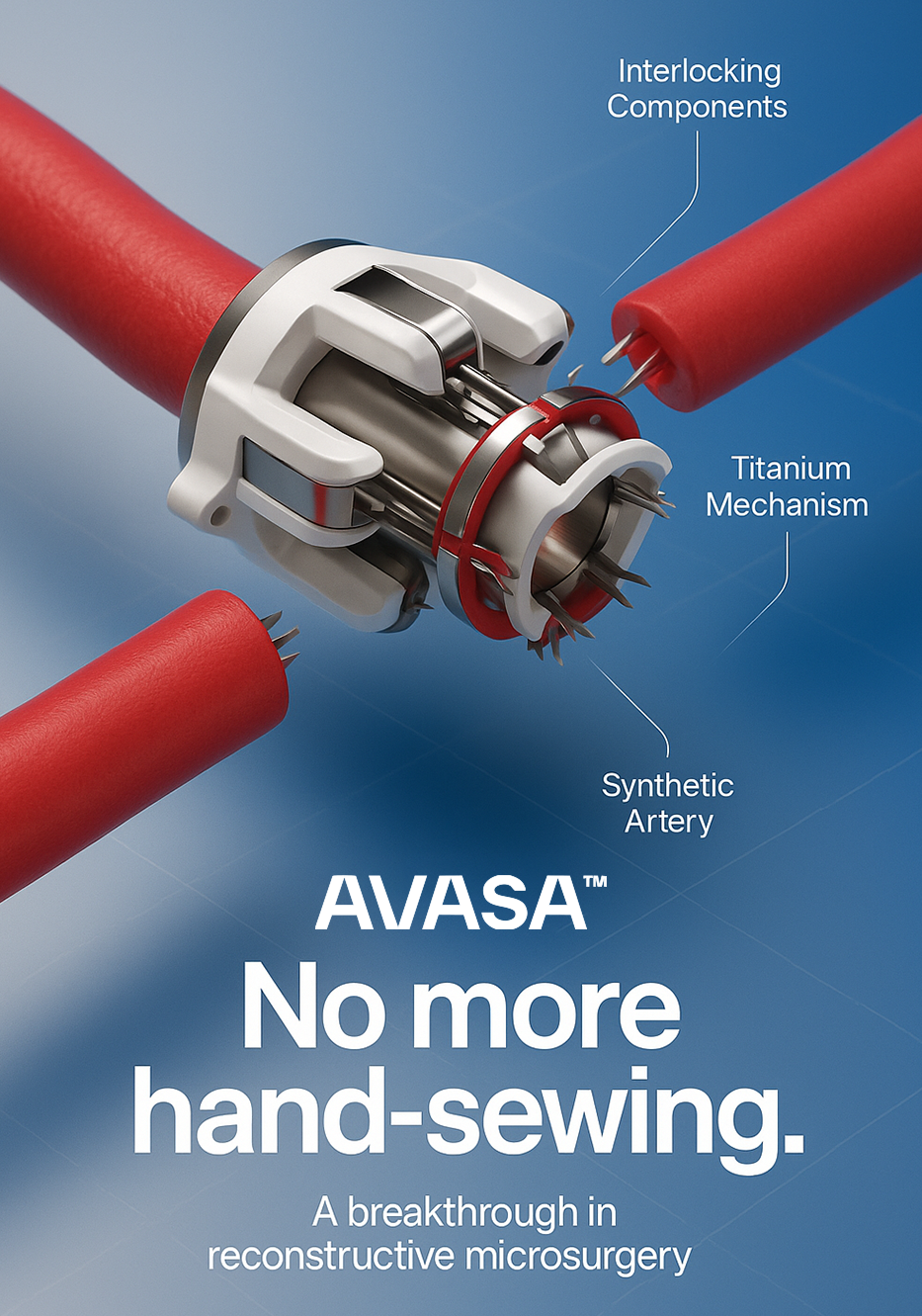
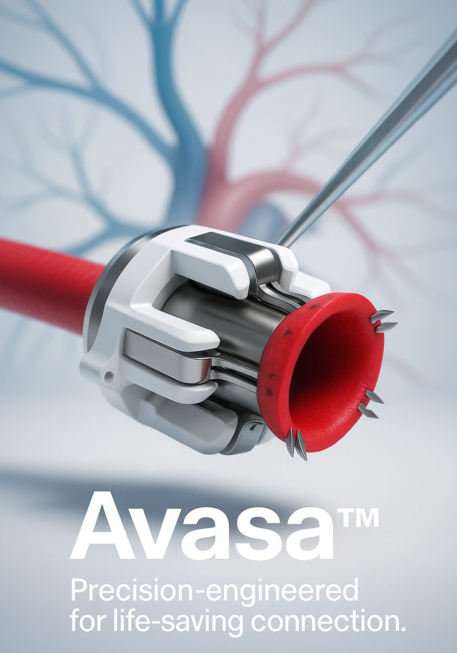
Avasa is a pioneering New Zealand medtech start-up developing the world’s first arterial coupler—an implantable device set to revolutionise microsurgery by reducing operating time and improving outcome
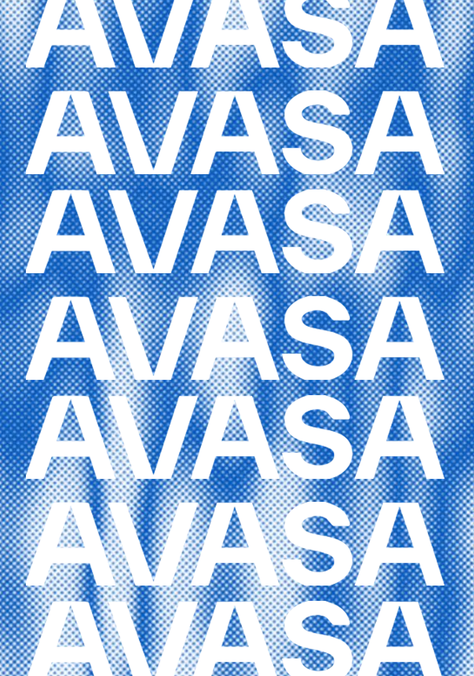
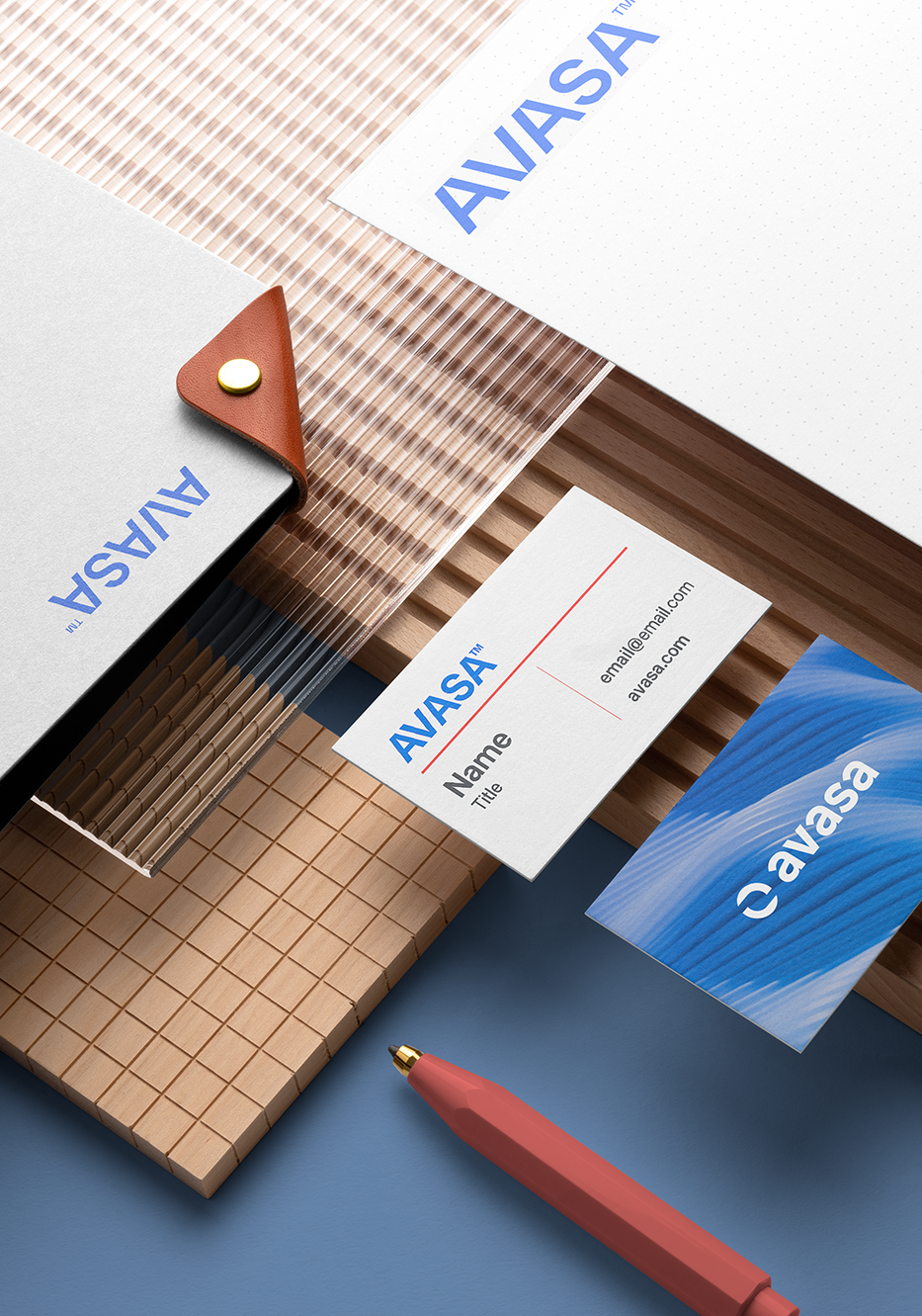
I led the brand identity design for Avasa, including logo development and core visual assets that reflect the company’s innovation at the intersection of medicine, design, and engineering. My work helped shape a cohesive, future-focused brand presence that could resonate with clinicians, investors, and partners during critical milestones like FDA pre-submission and Series A fundraising. Supporting a product with such transformative potential required a balance of clinical precision and bold visual storytelling. https://www.avasa.io/
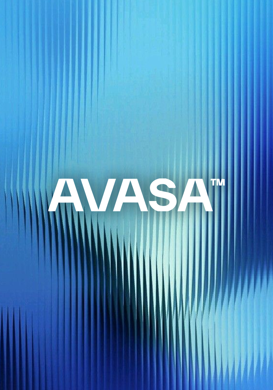
Final Design(s)
I led the brand identity design for Avasa, including logo development and core visual assets that reflect the company’s innovation at the intersection of medicine, design, and engineering. My work helped shape a cohesive, future-focused brand presence that could resonate with clinicians, investors, and partners during critical milestones like FDA pre-submission and Series A fundraising. Supporting a product with such transformative potential required a balance of clinical precision and bold visual storytelling.
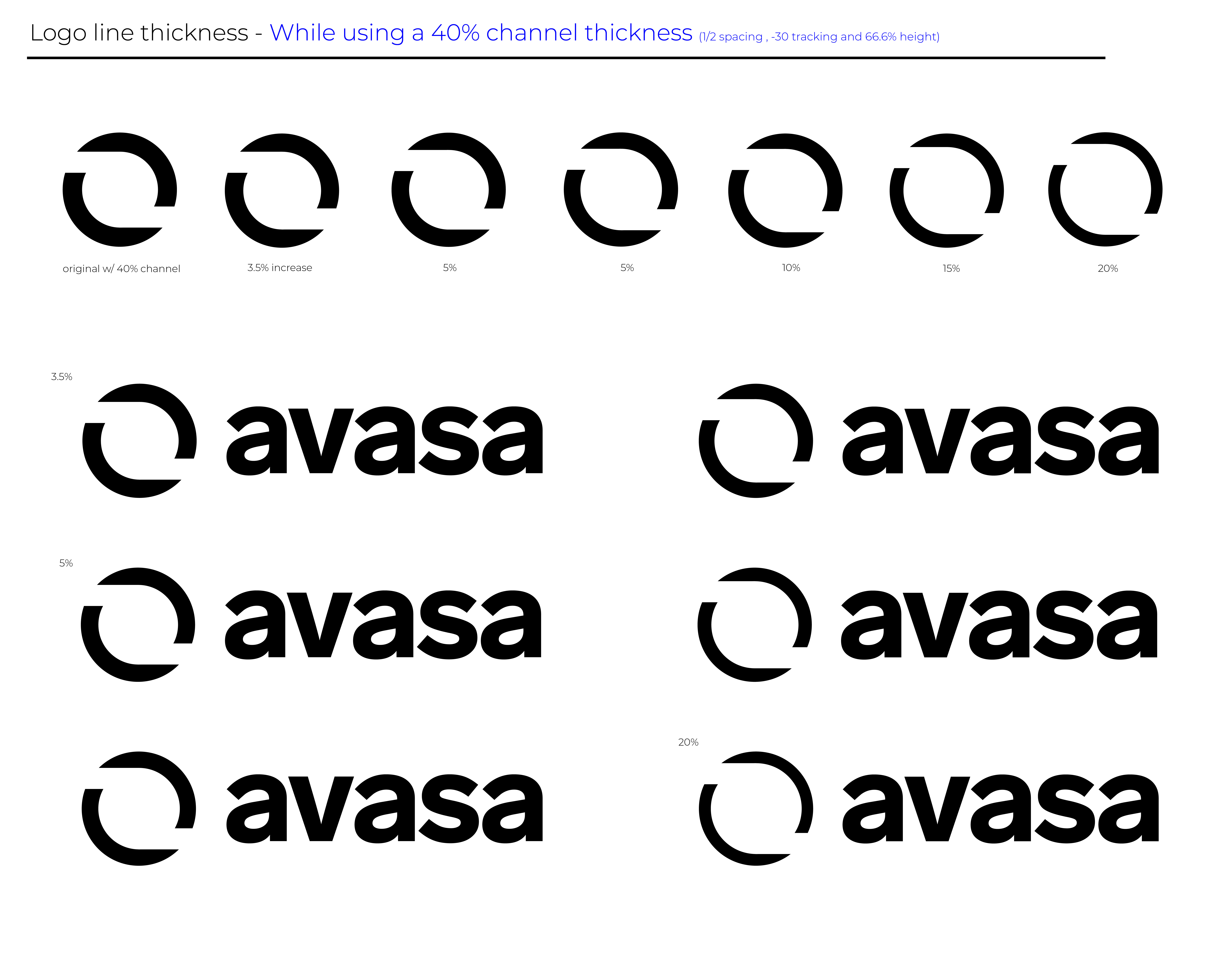
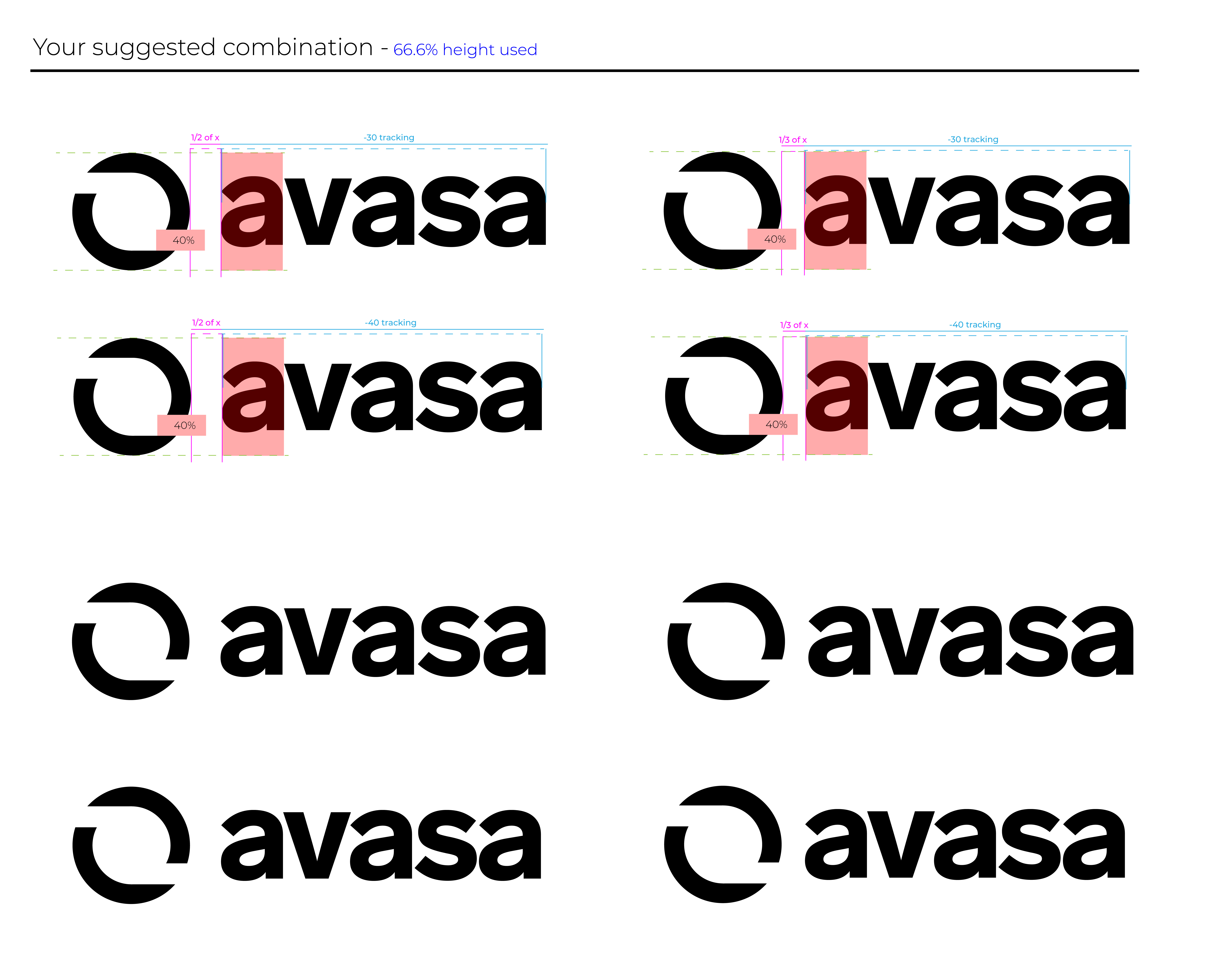
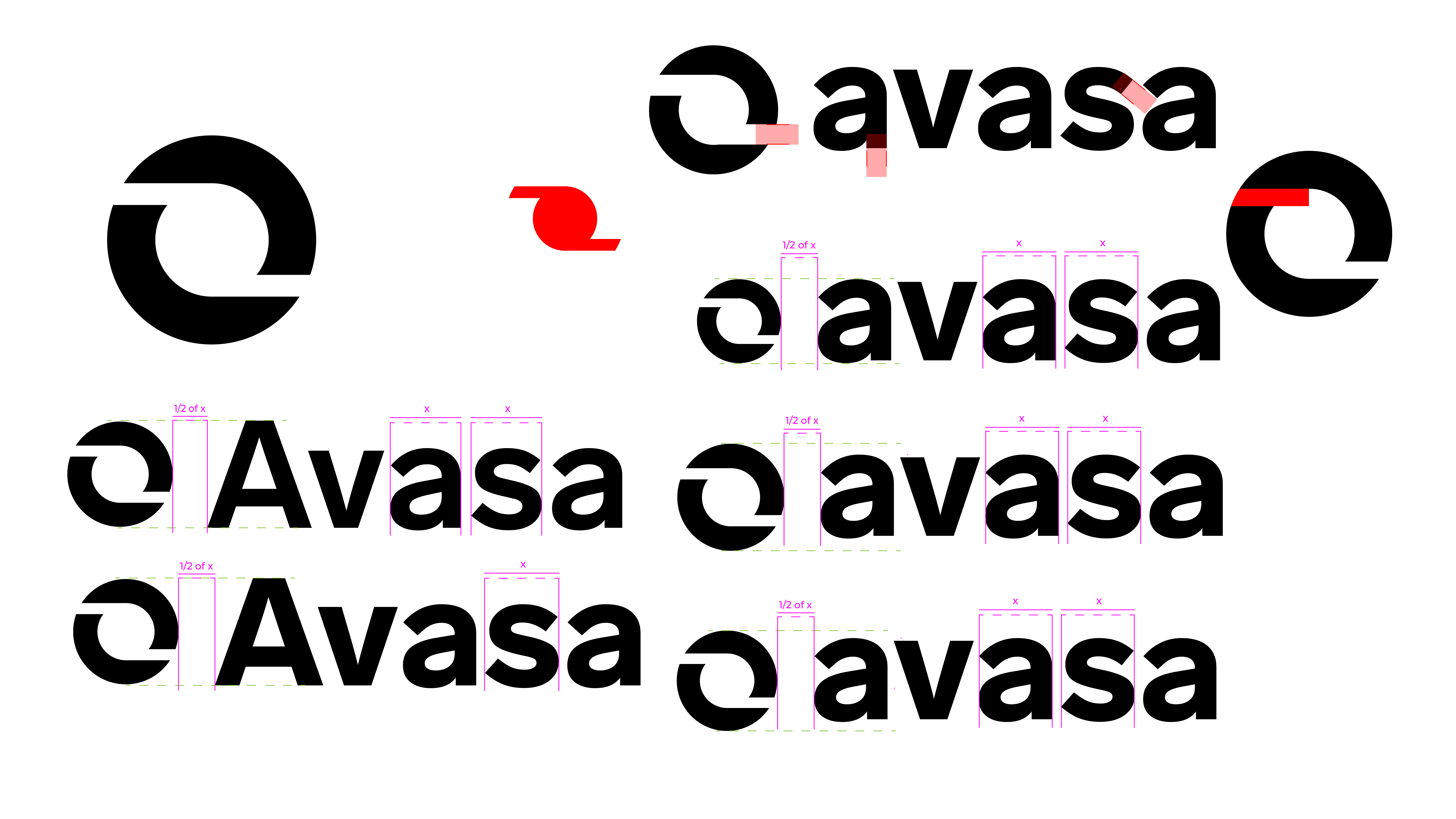
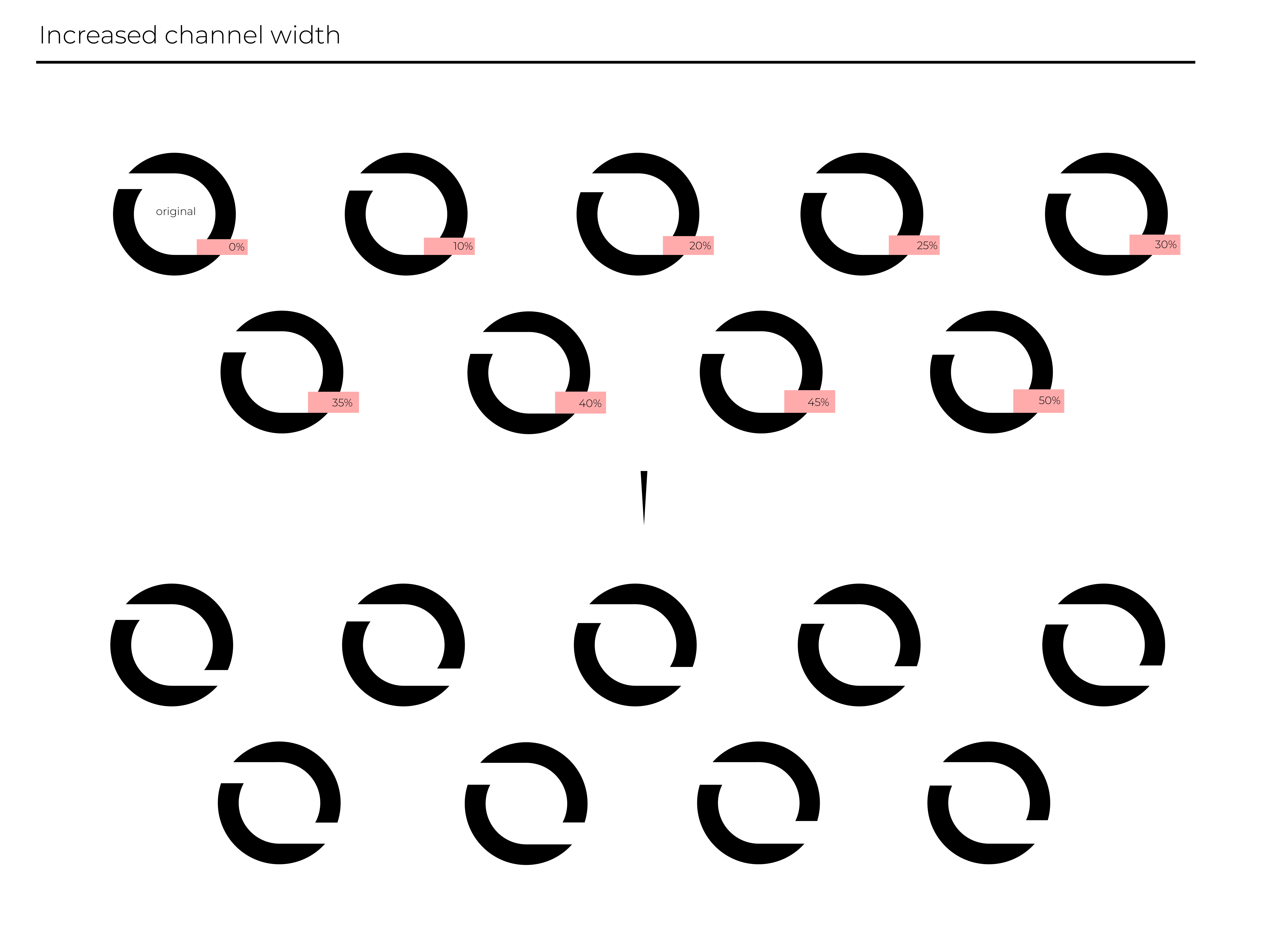
Process
Reflection
Designing for High-Stakes Innovation: Working on Avasa pushed me to consider how design functions in a high-stakes, life-saving context. The branding couldn't just look sleek — it needed to convey trust, precision, and progress in a medical environment. Every design choice, from typography to spacing, was weighed against the device’s clinical purpose. It challenged me to balance aesthetics with meaning in a way that felt purposeful, not performative.
Shaping a First-of-Its-Kind Identity: Avasa wasn’t just another health brand, it was the first of its kind, and the identity had to reflect that. Since no arterial coupler existed before this, I had no direct visual references. Instead, I drew from the intersecting worlds of surgery, biotech, and innovation, crafting a minimal but dynamic brand language that communicates breakthrough without overwhelming the viewer.
Collaborating With Visionaries: Partnering with a team of engineers, physicians, and medtech investors was an entirely different kind of collaboration. I had to quickly learn how to translate scientific jargon into accessible visual communication. It was a valuable lesson in listening, asking the right questions, and designing with empathy
Translating Complexity Into Clarity: Microsurgery is an incredibly complex field, but my role was to distill that complexity into a visual identity that felt simple, clean, and clear. One of my biggest takeaways was learning how to visually simplify an advanced, technical innovation without dumbing it down. The result was a design system that reflects the precision of the device while staying human-centric.
