Saying Everything Without a Single Word
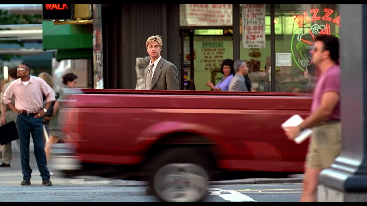
A breakdown of the unforgettable Meet Joe Black street-crossing scene and how its subtle glances, pacing, and silence inspired me to craft a wordless moment of my own in my first short film.
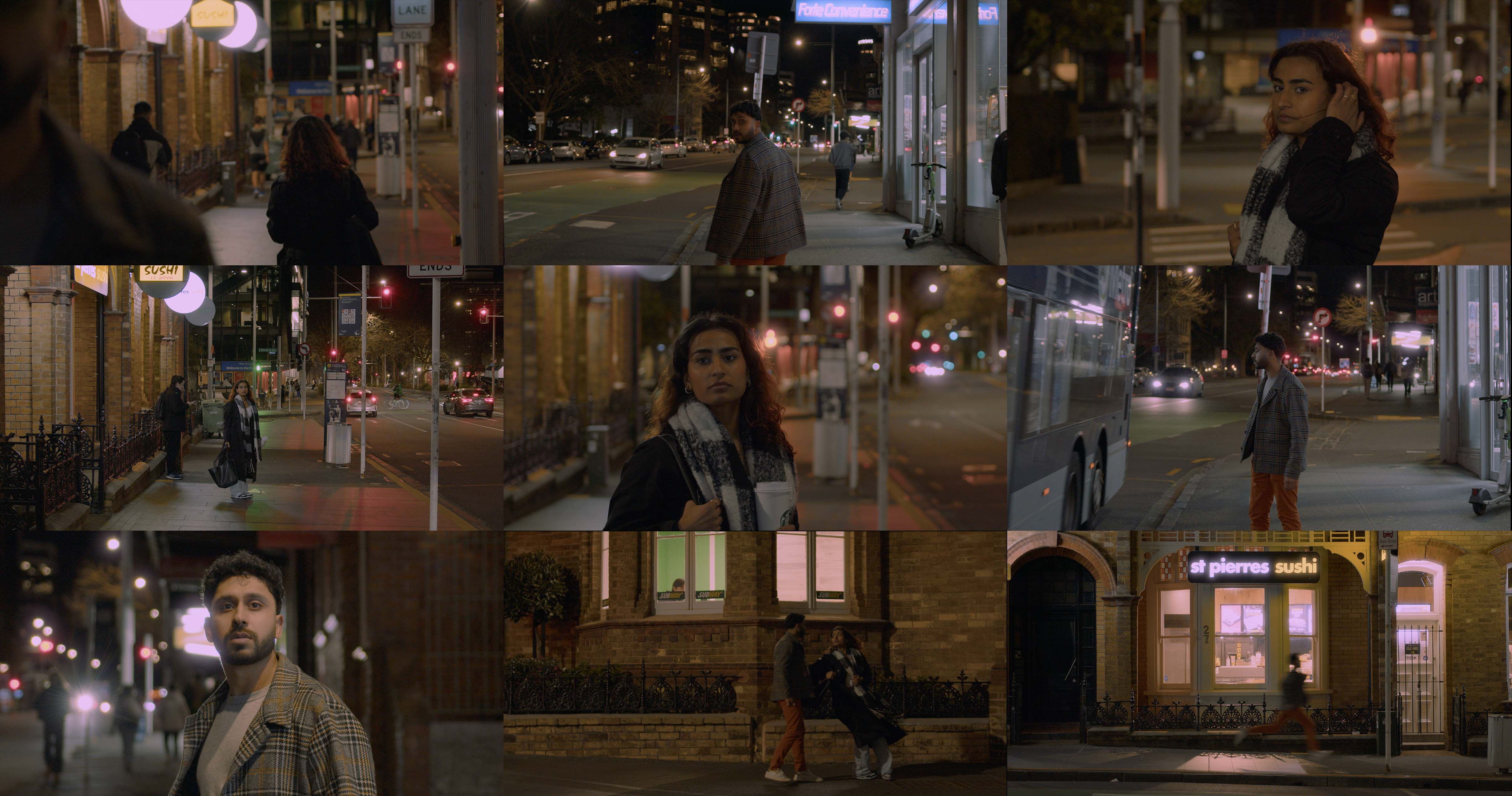
Two people, standing on opposite sides of a busy street, exchange a glance. The world around them keeps moving cars, footsteps, city noise but in that moment, they only see each other. They start to walk away, then turn back. Then again. It’s a wordless conversation told entirely through movement, glances, and pauses.
The Original Design
Scene: The street-crossing moment in Meet Joe Black (1998) where two characters part ways, then glance back at each other multiple times.
Cinematography: Wide shots that let the busy street fill the frame, creating distance and tension between the characters.
Pacing: Each look-back is perfectly timed, stretching the moment without feeling slow.
Sound: Ambient city noise underlines the realism, just subtle sound design.
Emotion: Builds connection without dialogue, relying on body language and silence.
Impact: A masterclass in non-verbal storytelling, showing how to convey meaning through pure visual rhythm.
Why this scene Inspires Me
Emotional Precision: Showed me how powerful subtle movements and glances can be in creating emotional tension.
Less is More: Reinforced the idea that you don’t always need dialogue, silence can be more impactful.
Visual Storytelling: Inspired me to focus on framing and pacing to let the audience feel the moment without over-explaining.
Translating to My Work: In my short film, I borrowed the “multiple look-backs” technique to stretch time and build anticipation.
Creative Confidence: This scene gave me the confidence to trust stillness, space, and simplicity in my own directing.
How I Applied It to My Own Work
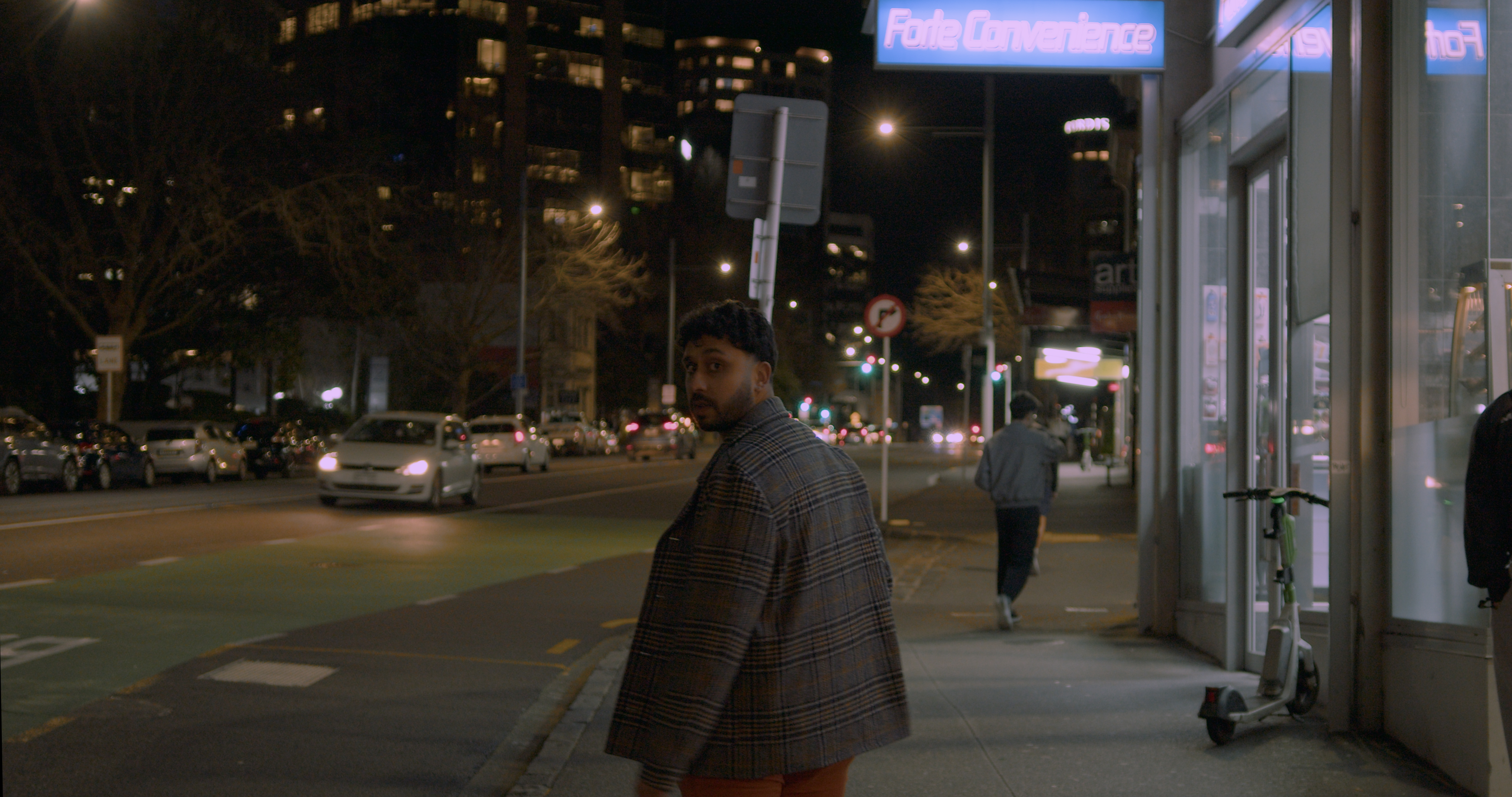
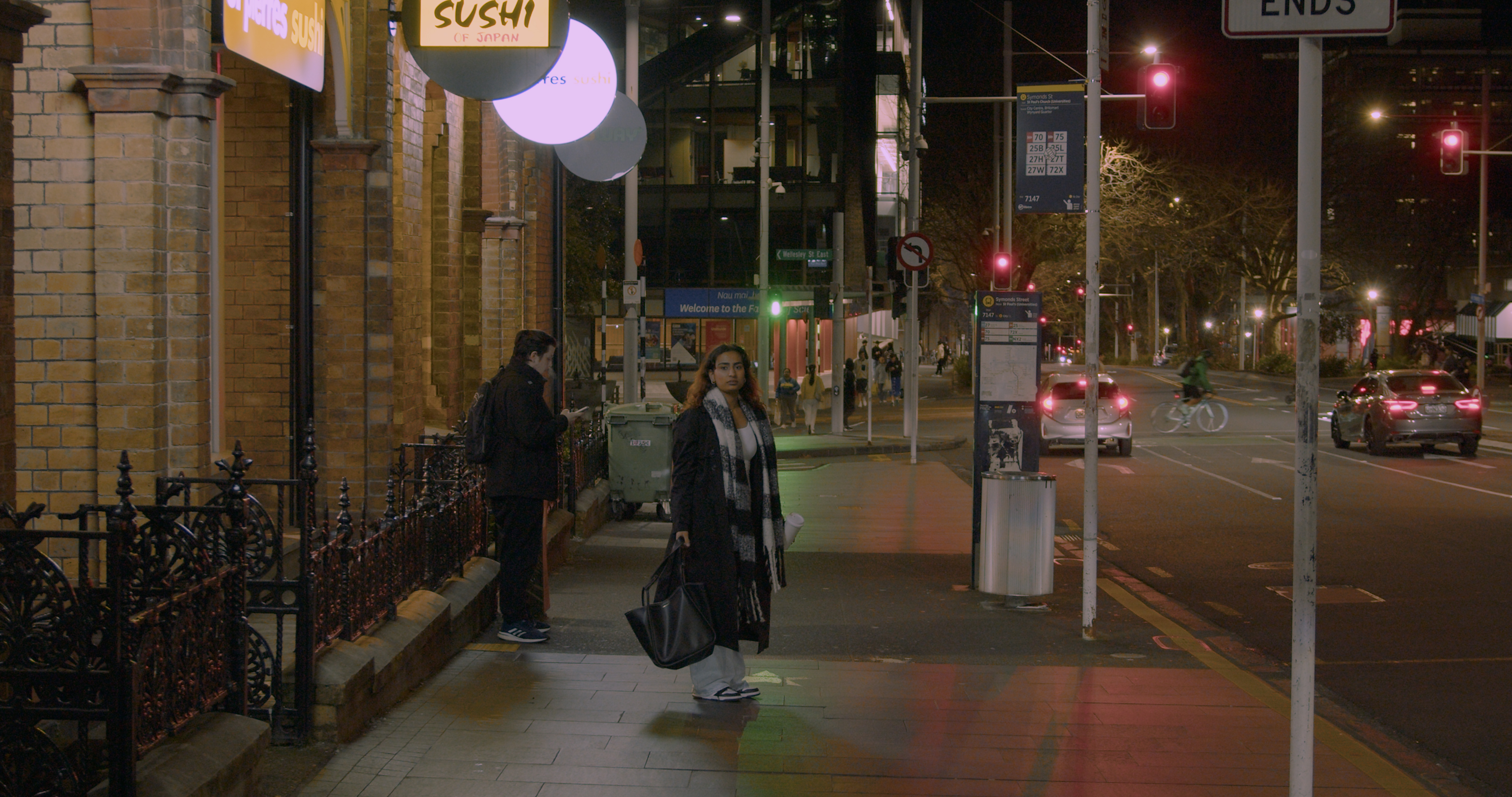

Multiple Look-Backs: Used repeated glances between characters to build a slow-burn tension, mirroring the rhythm of the original scene.
Silence as a Tool: Chose not to include dialogue during the key moment , letting body language and pacing speak for themselves.
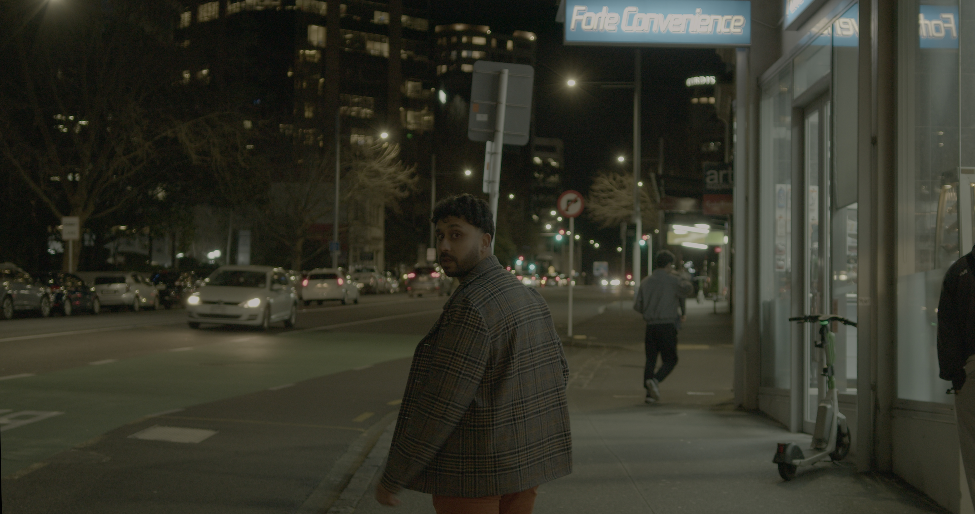
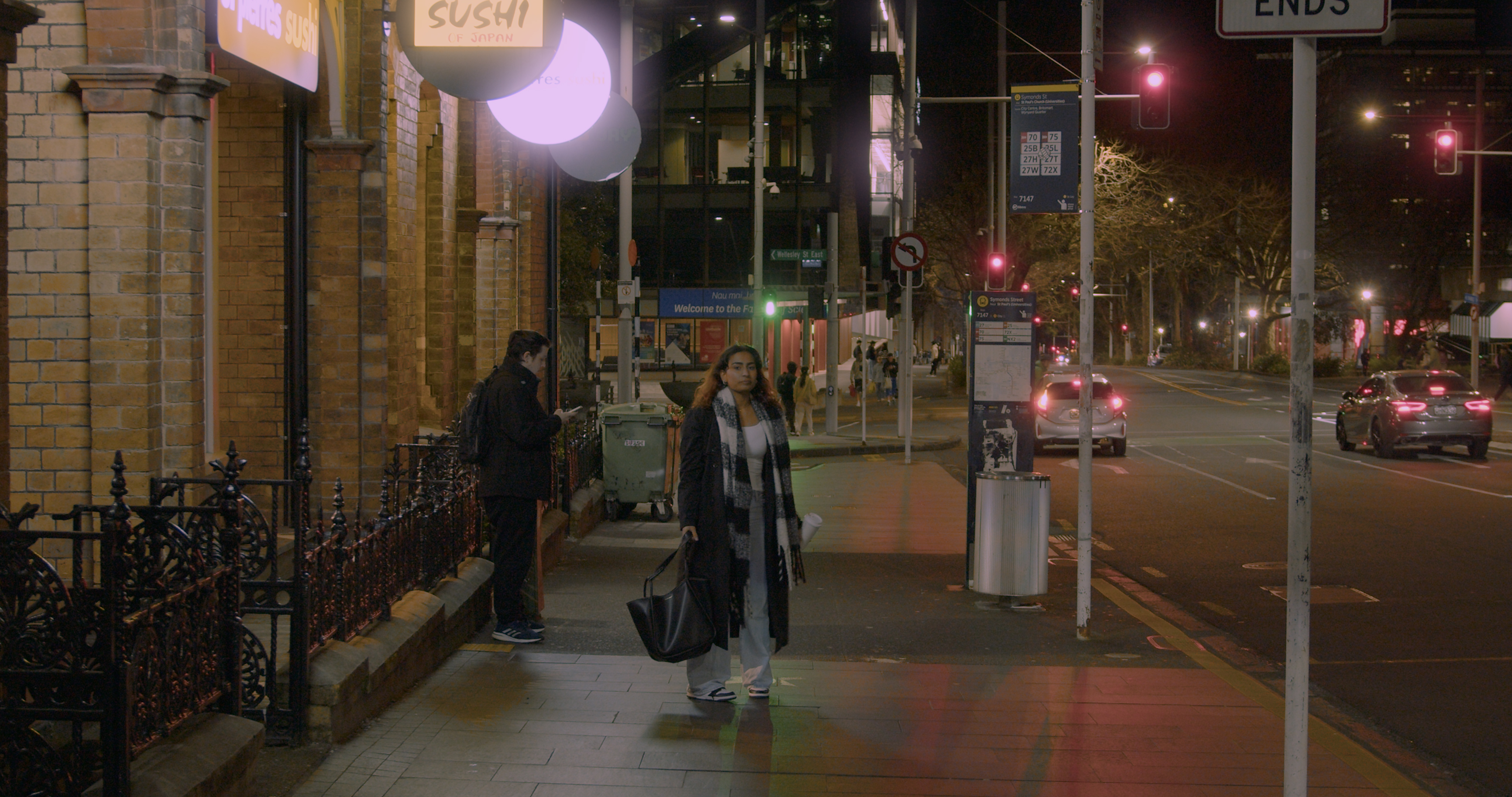
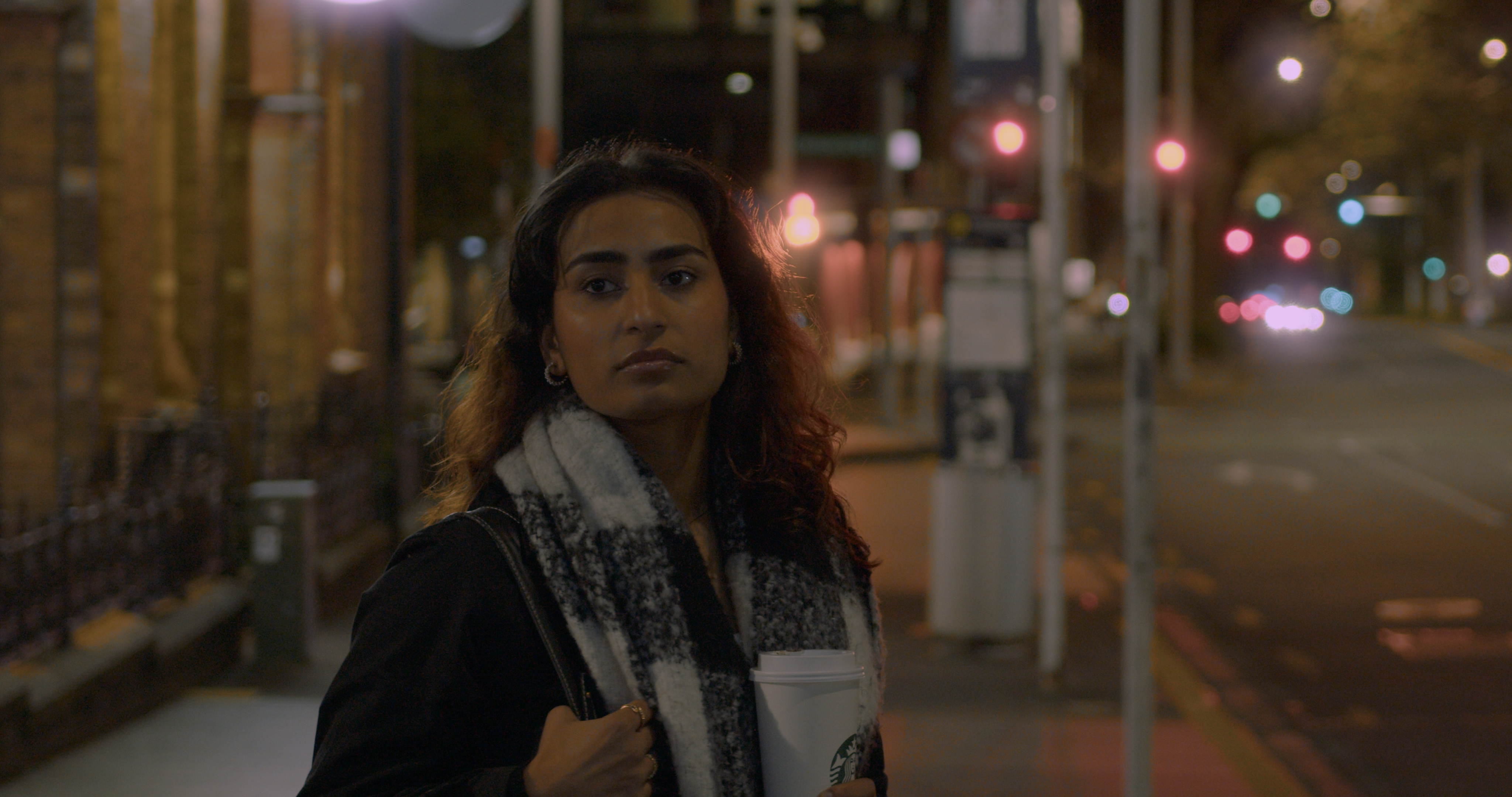
Urban Atmosphere: Framed the scene against Auckland streets at night to create a sense of intimacy within a public space.
Lighting Challenges: Worked with available street and shop lighting to capture mood while keeping faces visible.
Natural Performances: Guided actors to make movements subtle and unforced so the moment felt authentic rather than staged.
Adaptation, Not Copying: Kept the emotional essence of the Meet Joe Black scene but shifted tone and context to fit my story and characters.
Reflection
Growth in Directing: Studying this scene taught me to trust the audience , I don’t need to fill every silence with dialogue.
Editing Awareness: I became more deliberate with timing in the edit, letting moments breathe instead of cutting too quickly.
If I Did It Again: I’d plan lighting more intentionally and experiment with even slower pacing to heighten tension.
Big Takeaway: The most memorable moments can be the quietest ones, where visual storytelling carries the entire emotional weight.
How Dan Moran’s colour grading Influenced My Film
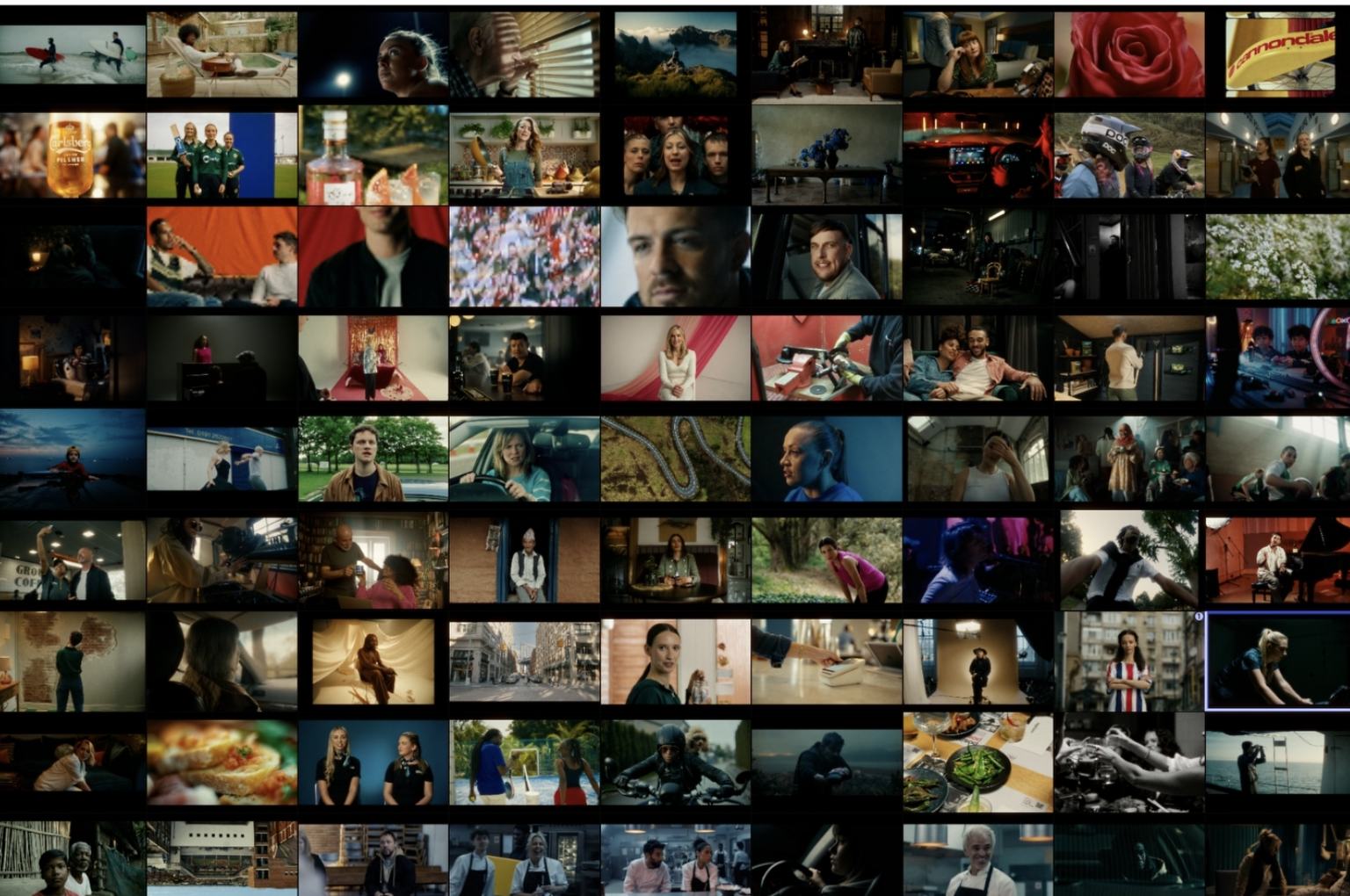
Who: Dan Moran, Senior Colourist at Company 3 London.
Impact: His work demonstrates how grading can subtly steer audience emotion without pulling focus away from performance.
Signature Look: Rich contrast, controlled highlights, and intentional use of teal, cyan, and muted warm tones for a balanced yet expressive aesthetic.
Style: Cinematic, emotionally-driven color palettes that enhance mood and narrative.
Why It Inspires Me
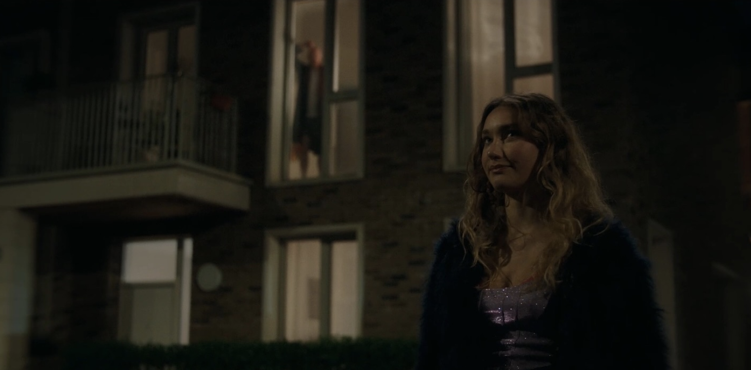

Mood Shaping: Showed me how colour grading can dictate the emotional undertone of a scene.
Modern Cinematic Feel: Helped me aim for a polished, professional look that still feels natural.
Visual Consistency: Reinforced the importance of a cohesive palette throughout a project.
Subtle Storytelling: Proved that grading isn’t just about making things “look pretty,” but about reinforcing story beats.
How I Applied It to My Own Work
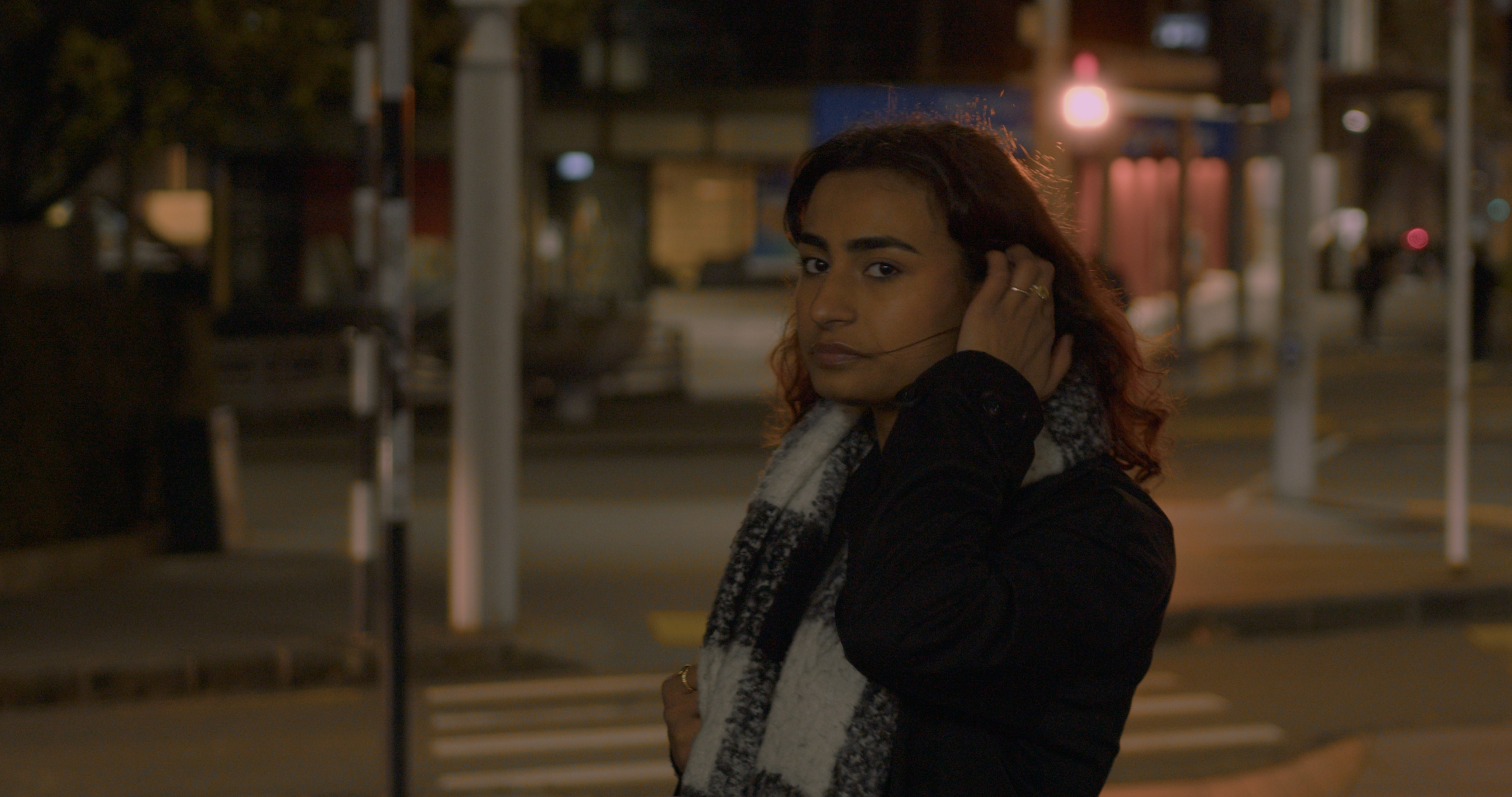
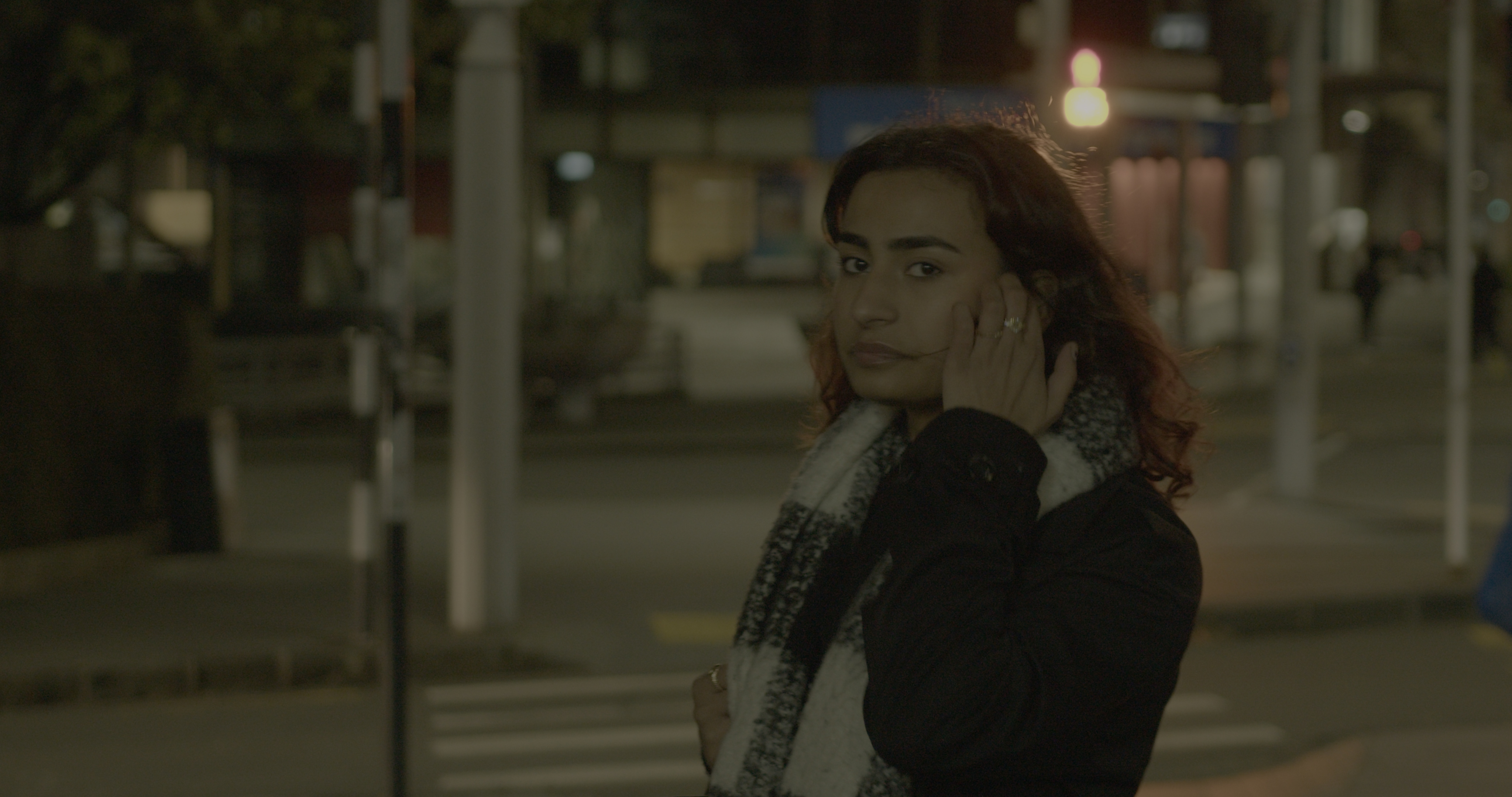
Cohesive Palette: Chose a consistent night-time palette of deep blues and warm highlights, inspired by Moran’s balance of cool/warm contrasts.
Highlight Control: Softened bright areas to keep the audience focused on the characters’ faces.
Texture & Depth: Used subtle shadow enhancement and midtone control to add richness without oversaturating.
Real-World Adaptation: Applied his cinematic style within the limits of available street lighting in Auckland.
*Left side is colour graded
*Right side is Raw file (non colour graded)



Reflection
Growth in Post-Production: Studying Moran’s work pushed me to think of grading as part of directing , not just a finishing step.
If I Did It Again: I’d create a detailed color plan during pre-production to better align lighting choices with the final grade.
Big Takeaway: A great grade isn’t loud, it’s invisible in service to the story, yet deeply felt by the audience.

